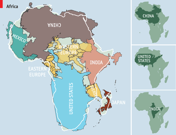
The true size of Africa
When looking at a traditional map, it might seem like I’m already halfway down to Cape Town. But 1/3 is probably more accurate, and this “optical illusion” is caused by something called map projection. Not surprisingly, visualizing a spherical planet on a flat surface is not trivial. Traditional maps use the Mercator projection that causes land mass close to the equator to look smaller than it actually is, and vice versa. That’s for example why Greenland looks as big as Africa, when in fact Africa is fourteen times larger!
The map below, which uses an equal-area map projection called Gall-Peters, illustrates the world a bit better, and here we can see that I have more than half left:
Actually, this animation best shows the differences between the two projections:
To further explain the immense size of Africa, here’s an interesting visualization:


wooo! Quite interesting!
Knowing this in theory and actually seeing the visualization are two quite different things… thanks for this post, it was enlightening.
Hope you have many more great moments on this trip!
Saw this visualization the other day, and immediately thought about you: did Carl ever think about the sheer size of Africa :-P
Thank you for posting maps that show very clearly how large is Africa in comparison to other areas of the world. Such maps make people a bit smarter.
Cool. I didn’t know (about the size,) and I’m a geographer!
Hi!
Wicked!!! (in a good way of course)
Best wishes for the 2nd half of your journey… fascinated & impressed :-)